
Master Virtual Tabletops Maps for Immersive Battle Grids
Updated on: 2025-12-02
This guide shows you how to design and run smooth, cinematic maps for online sessions—without pricey tools or endless prep. You’ll learn how to avoid common pitfalls, pick the right canvas size, keep files light, and reveal rooms and hazards at the perfect moment. The steps below are practical, beginner-friendly, and fast to implement. By the end, you’ll have a repeatable workflow that boosts immersion and reduces game-night friction.
- Myths vs. Facts
- Step-by-Step Guide to virtual tabletop maps
- Frequently Asked Questions
- Summary & Key Takeaways
If you’ve ever struggled to keep a remote session fast and immersive, virtual tabletop maps can be your secret weapon. With a clear process, you can build scenes that guide player choices, spotlight story beats, and keep combat readable. You don’t need expensive software, a designer’s eye, or hours of spare time—you just need a plan. Below, I’ll share a simple workflow I use for online sessions so you can move from “blank canvas” to confident GM, even on a busy week.
Myths vs. Facts
- Myth: You need premium apps for great results. Fact: Plenty of free or low-cost tools can produce crisp, readable battle maps.
- Myth: Digital maps ruin theater of the mind. Fact: They support it—use visuals for clarity and keep descriptions vivid for mood.
- Myth: Setup takes forever. Fact: Templates and reusable assets cut prep time dramatically once you build a basic kit.
- Myth: Maps are only for tactical combat. Fact: They shine for exploration, social scenes, and travel too—think taverns, markets, and waypoints.
- Myth: Bigger is always better. Fact: Oversized canvases slow loading and don’t add fun; right-sized files keep sessions snappy.
- Myth: Photorealism is the goal. Fact: Clarity beats detail; clean contrast and simple paths are more playable than ornamental textures.
- Myth: Hosting and sharing is complicated. Fact: Most platforms have drag-and-drop uploads and built-in optimization for quick starts.
Step-by-Step Guide to virtual tabletop maps
Step 1: Define the goal and mood
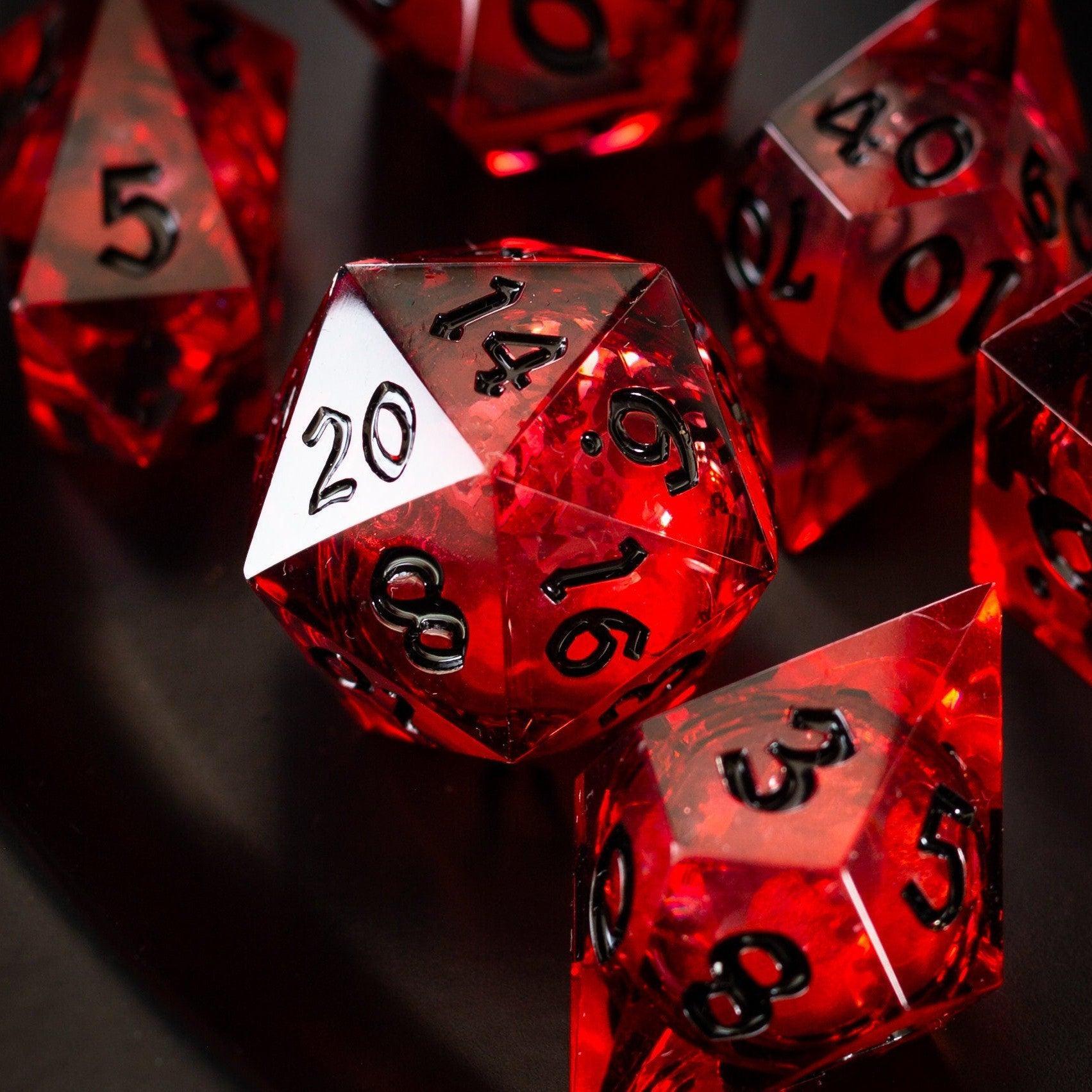
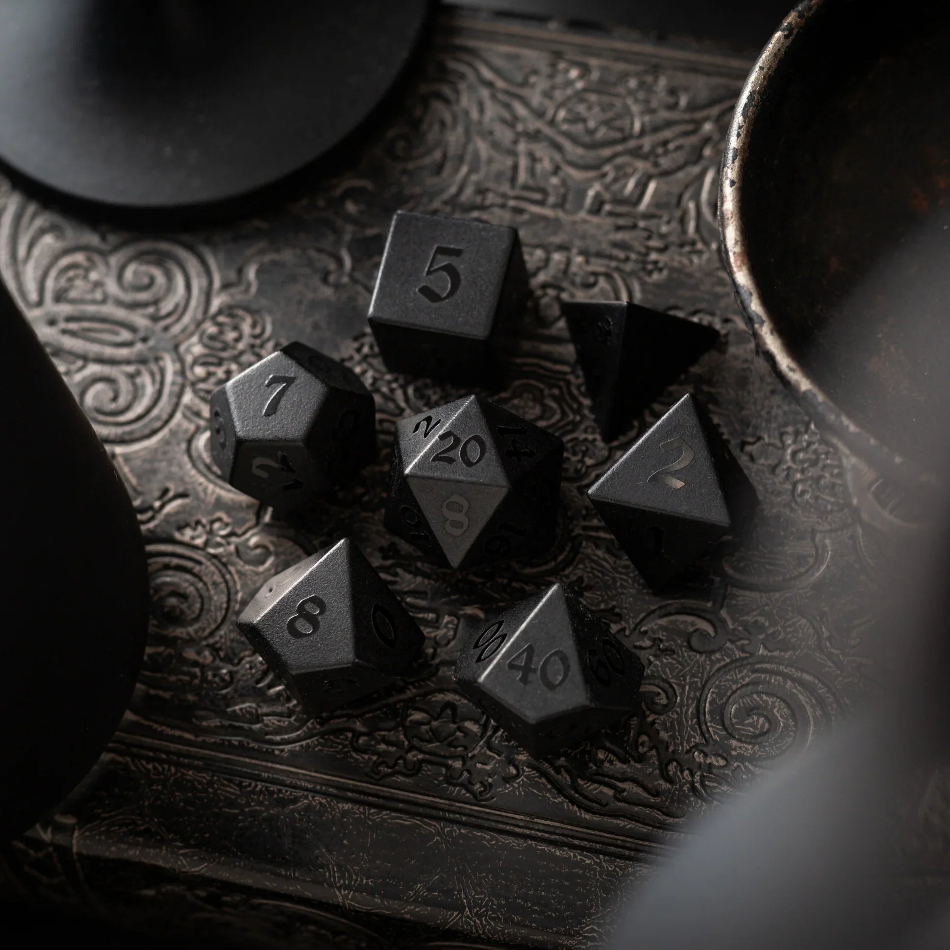
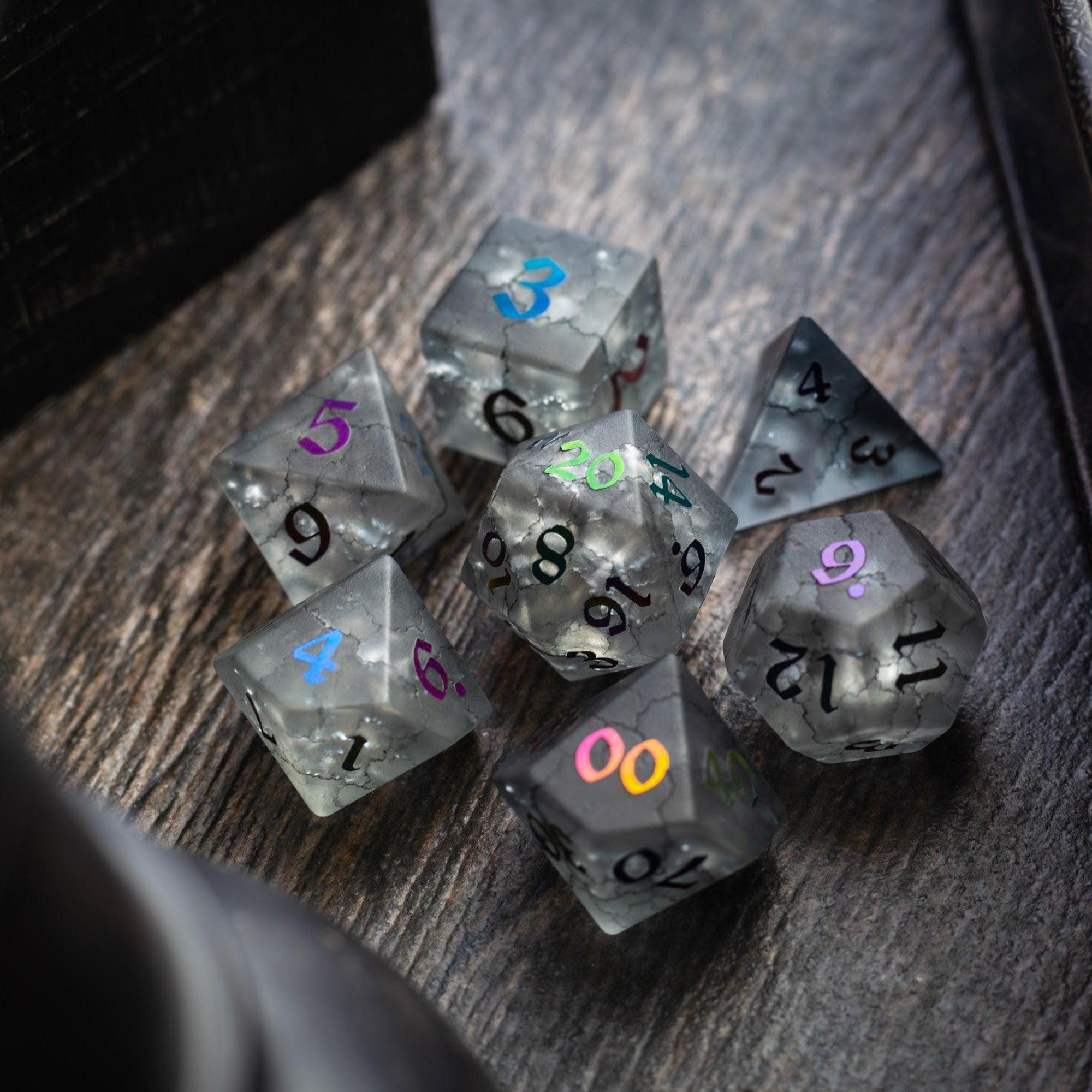
Before you open any app, write one sentence that captures the scene’s job: “Ambush at a fallen bridge,” “Quiet shrine with hidden traps,” or “Crowded bazaar with chase routes.” Pick a mood too—brooding, frantic, whimsical. This quick note keeps design choices aligned. If the vibe is ceremonial and refined, you might echo that in your physical play space with beautiful gemstone dice to match the tone when you roll.
Step 2: Choose size, grid, and scale
Decide how many squares you actually need. Most scenes play well in 20–30 squares on the longest side. A pixel density of around 70–150 per square keeps files workable while looking crisp on common displays. If your platform supports hexes or square grids, enable what your players expect. Consistency matters more than precision; if last week used 1 unit = 5 feet, stick with it this week too.
Step 3: Gather ethical, lightweight assets
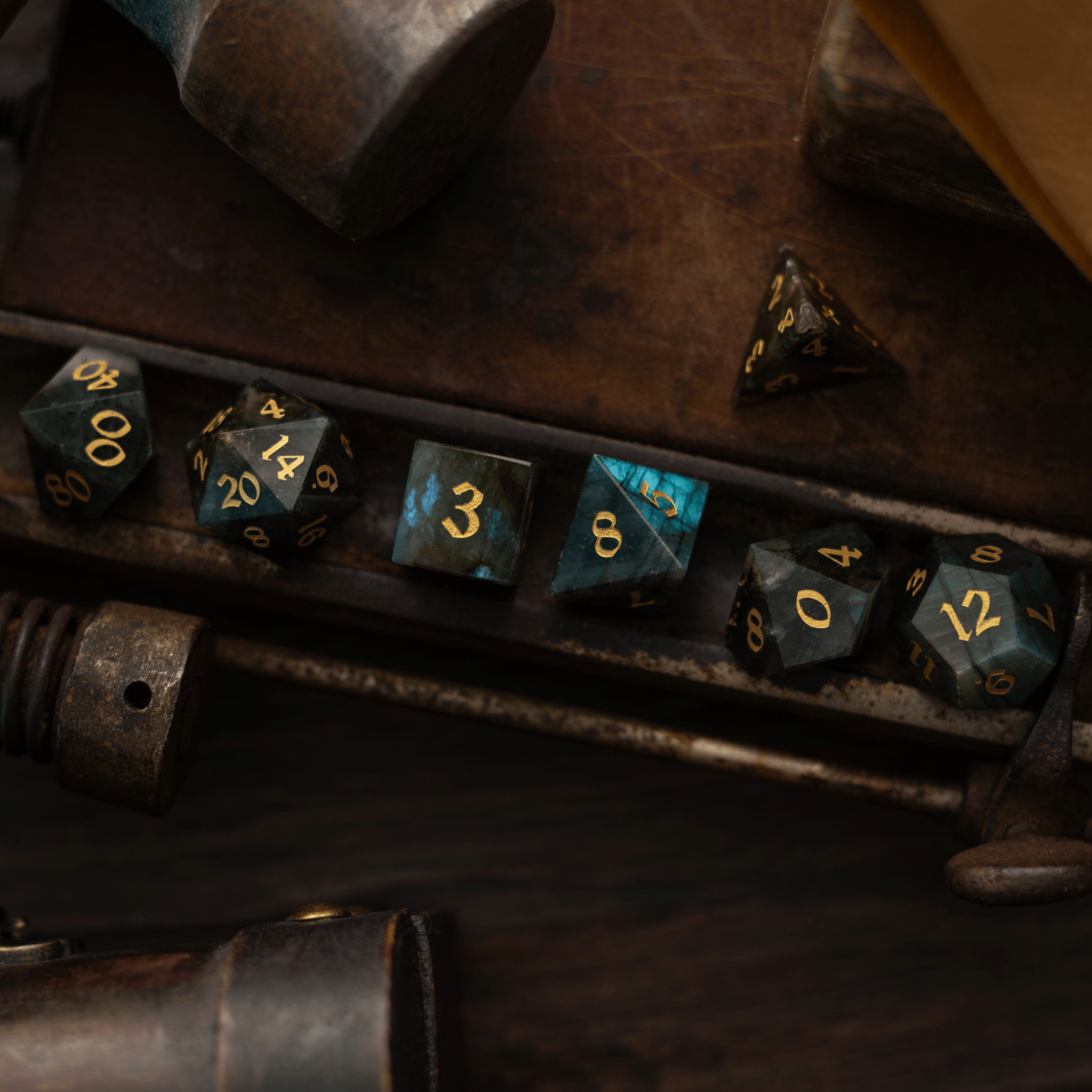
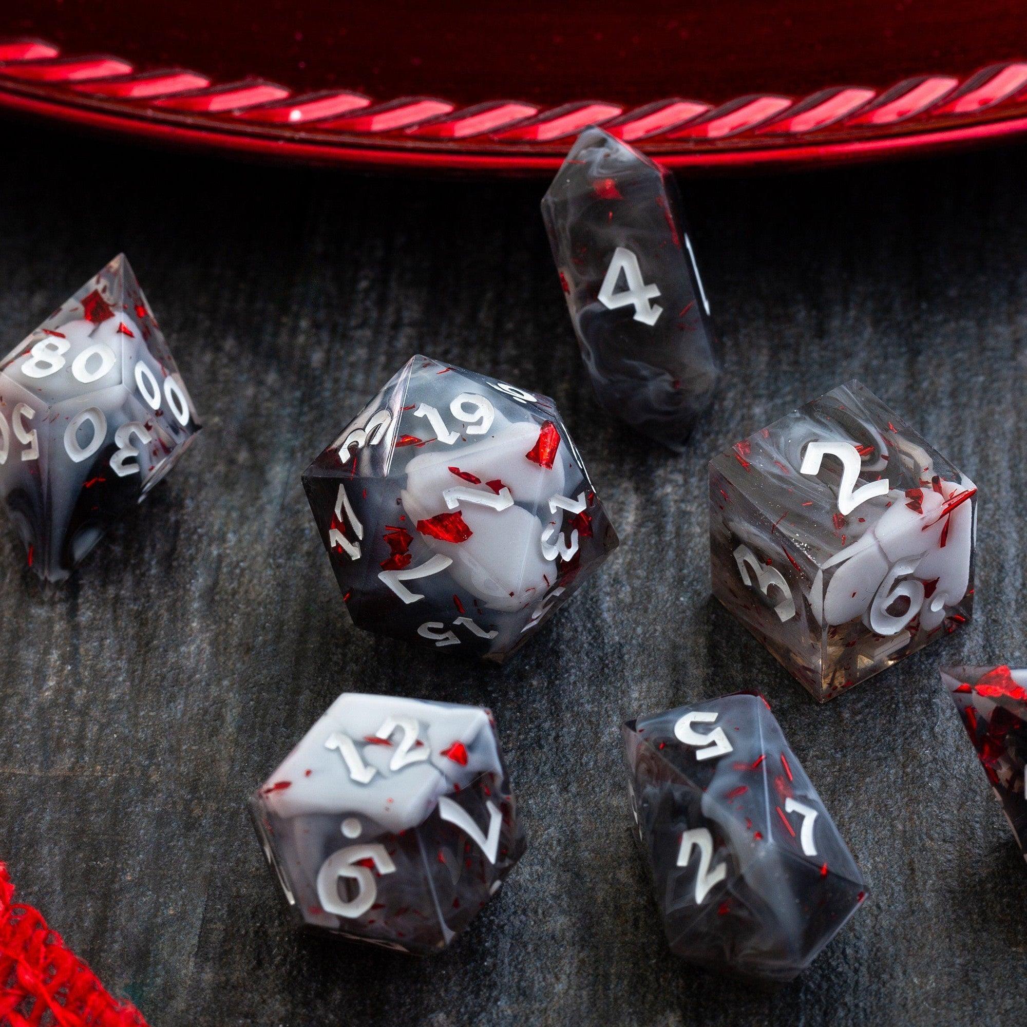
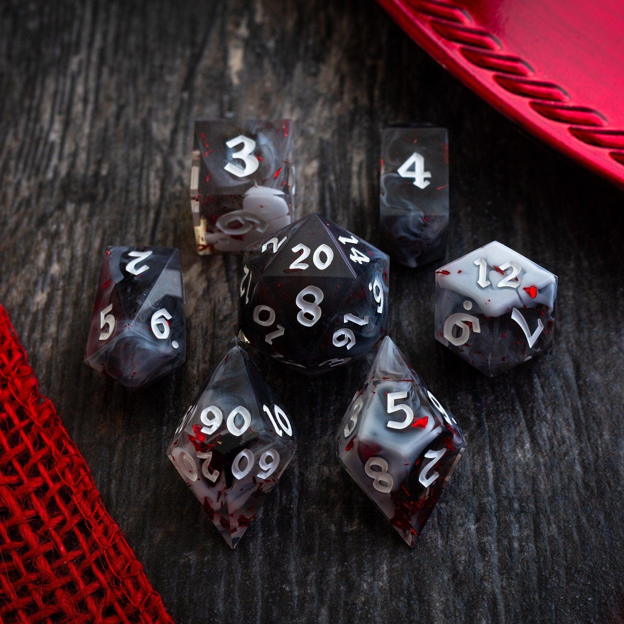
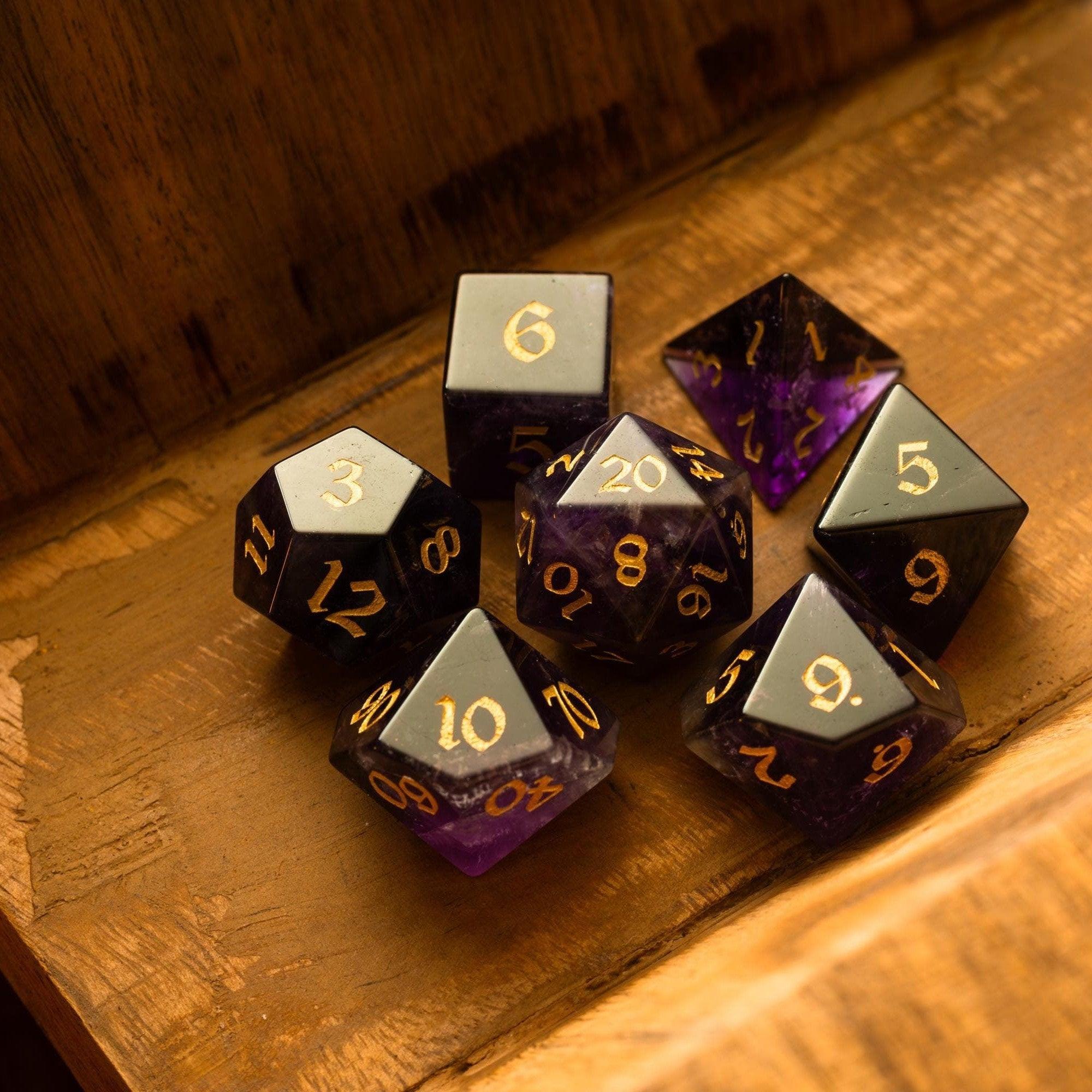
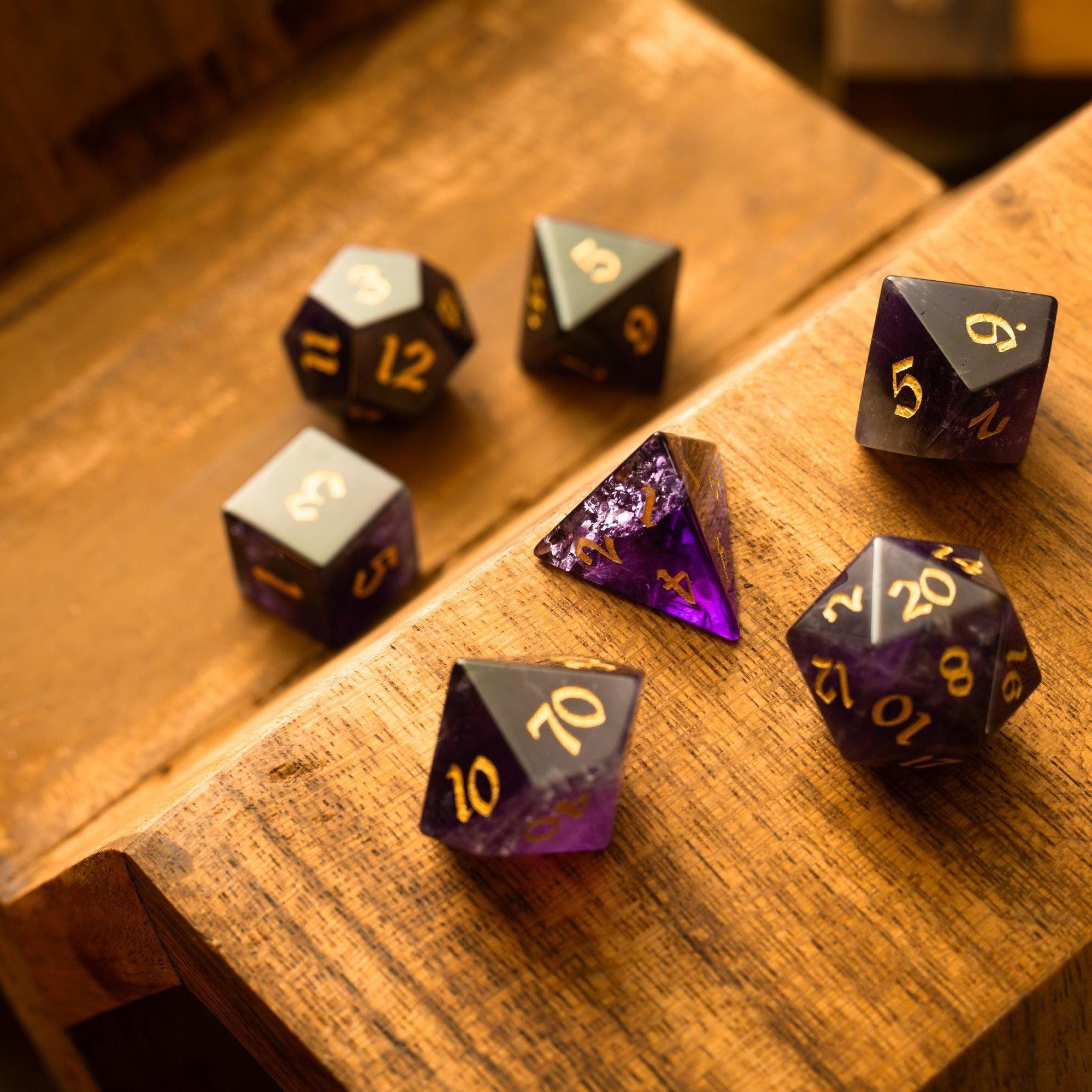
Use your own art or properly licensed packs. Stick to a restrained palette: a few walls/floors, one foliage set, one prop set. Convert PNGs to optimized formats when possible and compress images before import. Simple icons for doors, windows, and hazards beat heavy, shadow-laden props that bloat size. If your table loves flashy moments, reserve them for clutch rolls with eye-catching liquid core dice while the map itself stays lean.
Step 4: Block the layout and flow
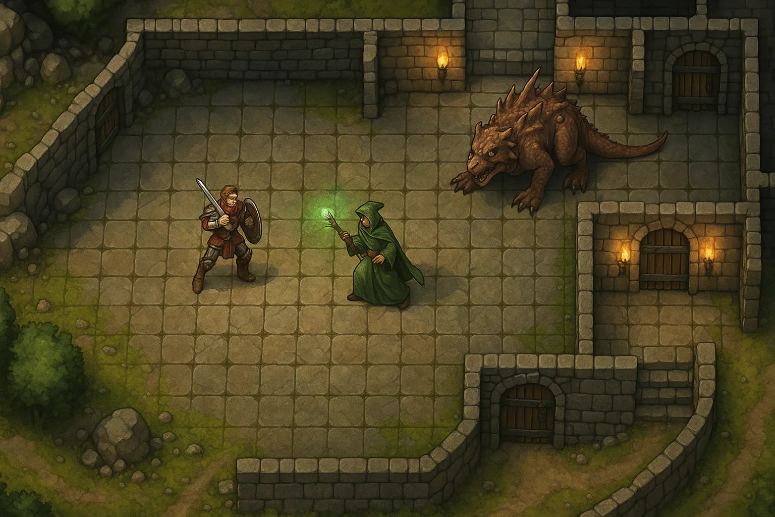
Sketch big shapes first: walls, cliffs, rivers, streets. Establish a clear path from entrance to objectives and place two or three decision points. Add sightlines where characters can discover clues at a glance. Reserve small details for areas players actually interact with—for example, the bridge’s cracked planks, not the entire riverbank. Keep important objects high-contrast against the floor so they’re instantly readable.
Step 5: Add light, line-of-sight, and labels
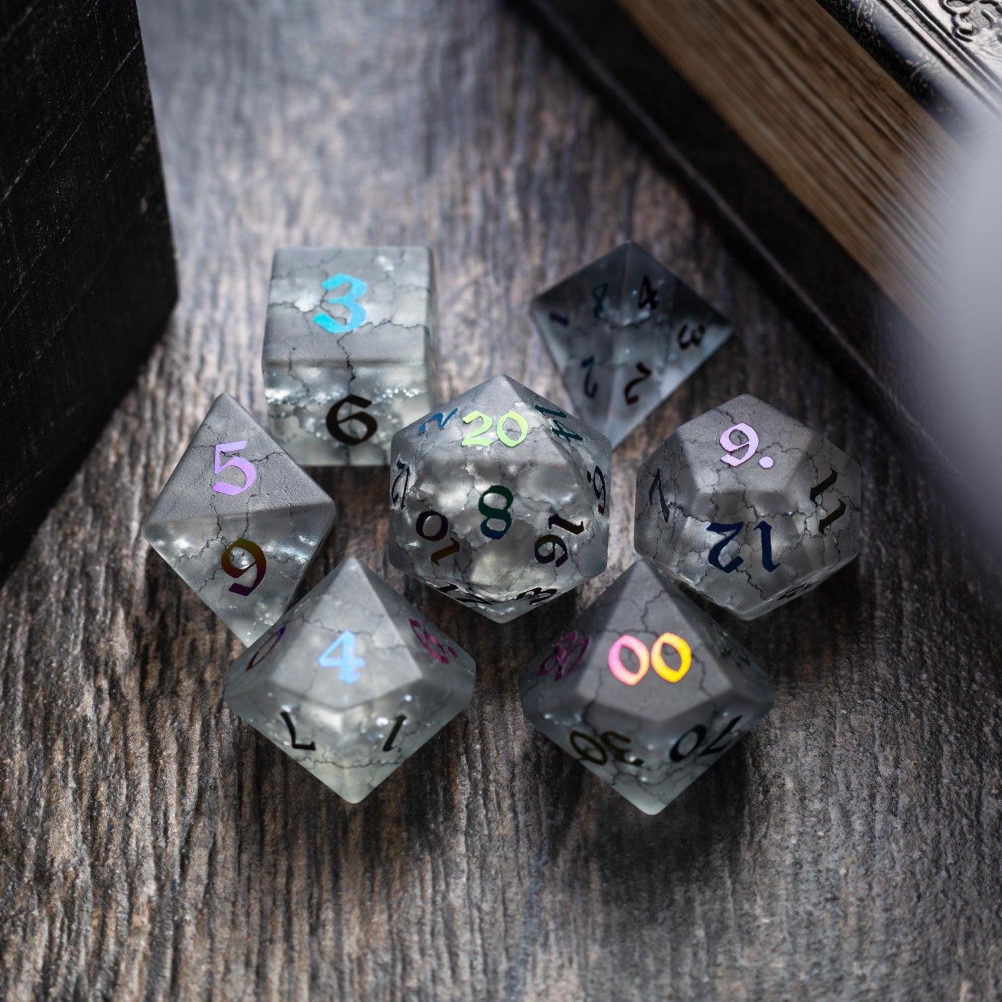
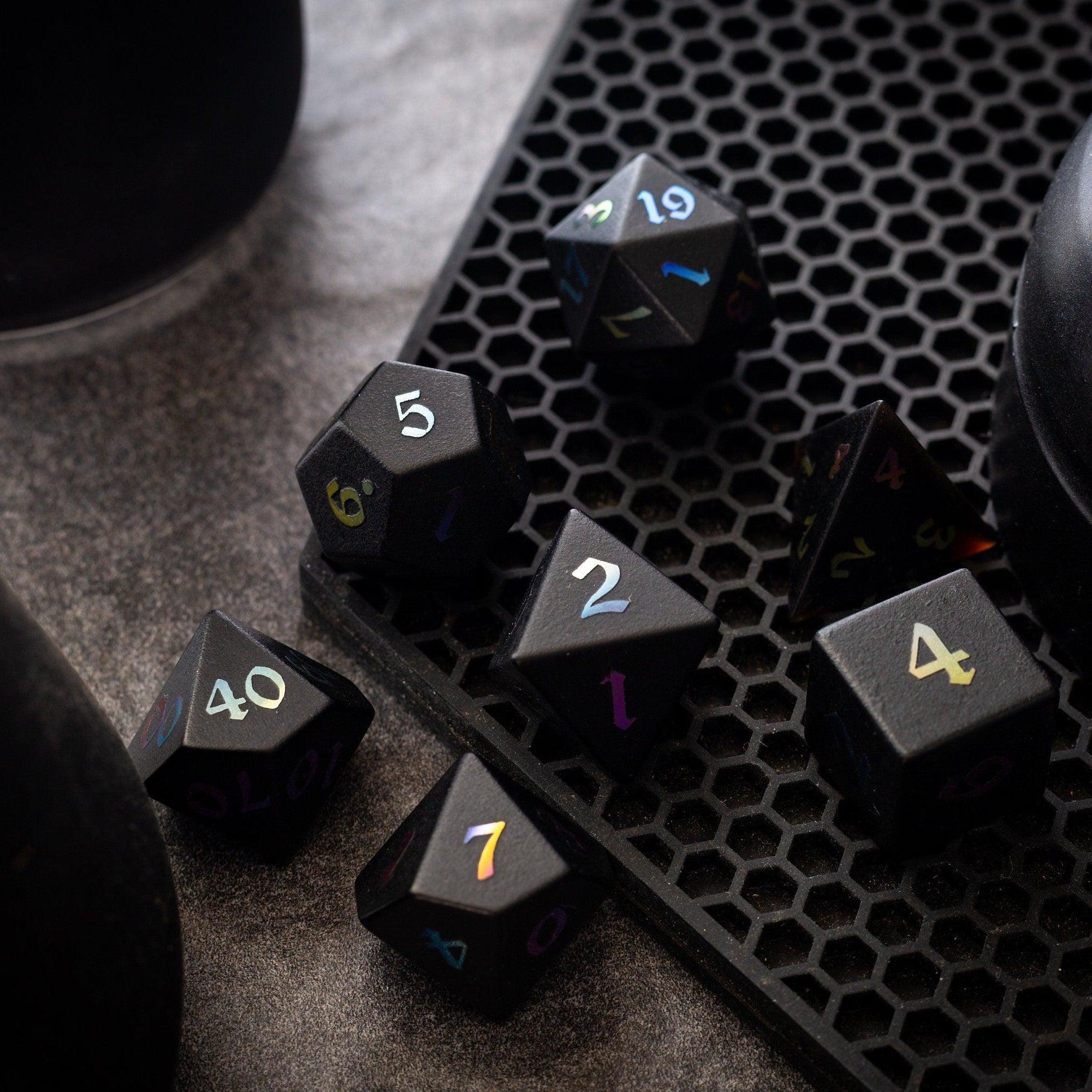
Lighting is a storytelling tool. Use soft pools of light to hint at safety or attention. Apply line-of-sight or walls to preserve secrets without hiding the whole map. Name key areas right on the canvas—“Collapsed Stair,” “Guard Post,” or “Rune Console”—so players understand options quickly. If your group likes clean, modern visuals, sleek sharp-edge resin sets pair well with minimalist, high-contrast layouts.
Step 6: Playtest, export, and prep scenes
Drop two or three tokens onto the canvas and run a one-minute mock turn: Can melee reach cover? Can ranged units aim without confusion? Are hazards obvious? Adjust contrast and spacing, then export. Favor lossless or lightly compressed outputs for line art and moderate compression for textured scenes. Save a GM version (with notes) and a Player version (clean). Finally, stage your reveals with fog of war and preload tokens so game night starts fast. If you enjoy a tactile flourish between scenes, a sturdy dice tower keeps rolls consistent and the focus on play.
Frequently Asked Questions
How big should a battle map be?
Plan for the encounter’s likely movement. Most skirmishes feel great on a canvas with 20–30 squares on the long edge. If you need a chase or siege, break it into connected zones rather than one giant file. Smaller, scene-based maps load faster and are easier to manage.
What’s the best file format?
Use PNG for crisp line art and icons; use high-quality JPEG or WebP for textured scenes with gradients. Keep transparency only where you need it (like overlays). Whatever you choose, export at a consistent pixels-per-square so tokens align perfectly every time.
How do I keep file sizes small?
Control size with three levers: canvas dimensions, pixels per square, and compression. Limit giant textures, reuse tiles, and compress before upload. Test load times by importing into your platform and viewing on a regular laptop—if it loads quickly there, your players should be fine.
Summary & Key Takeaways
You don’t need a studio-level workflow to deliver memorable online sessions. Start with your scene’s purpose, set the right size, and build from big shapes to small details. Keep contrast high, lighting intentional, and labels clear. Test with a quick mock round and export player-ready files so you can jump straight into action. A consistent, lightweight approach keeps your group focused on story, not loading screens.
- Clarity beats detail: readable paths and bold contrasts make better play.
- Right-size your canvas; huge files slow the fun.
- Reuse assets and compress to keep performance smooth.
- Stage reveals with line-of-sight tools for dramatic pacing.
- Match your table’s vibe with tactile touches like refined dice, but keep digital maps lean.


Leave a comment
This site is protected by hCaptcha and the hCaptcha Privacy Policy and Terms of Service apply.